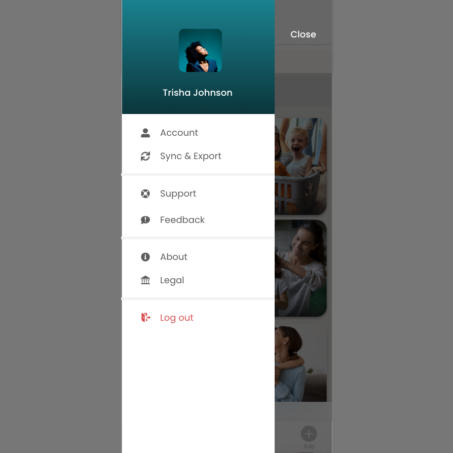
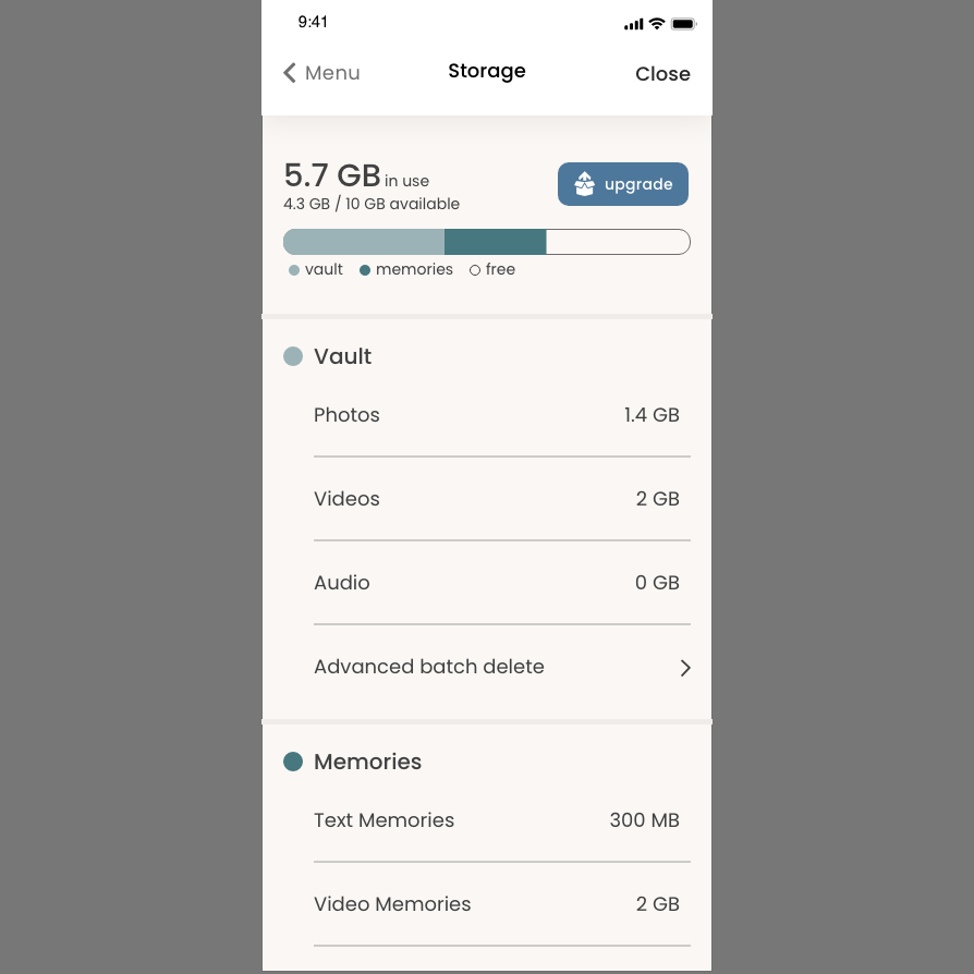
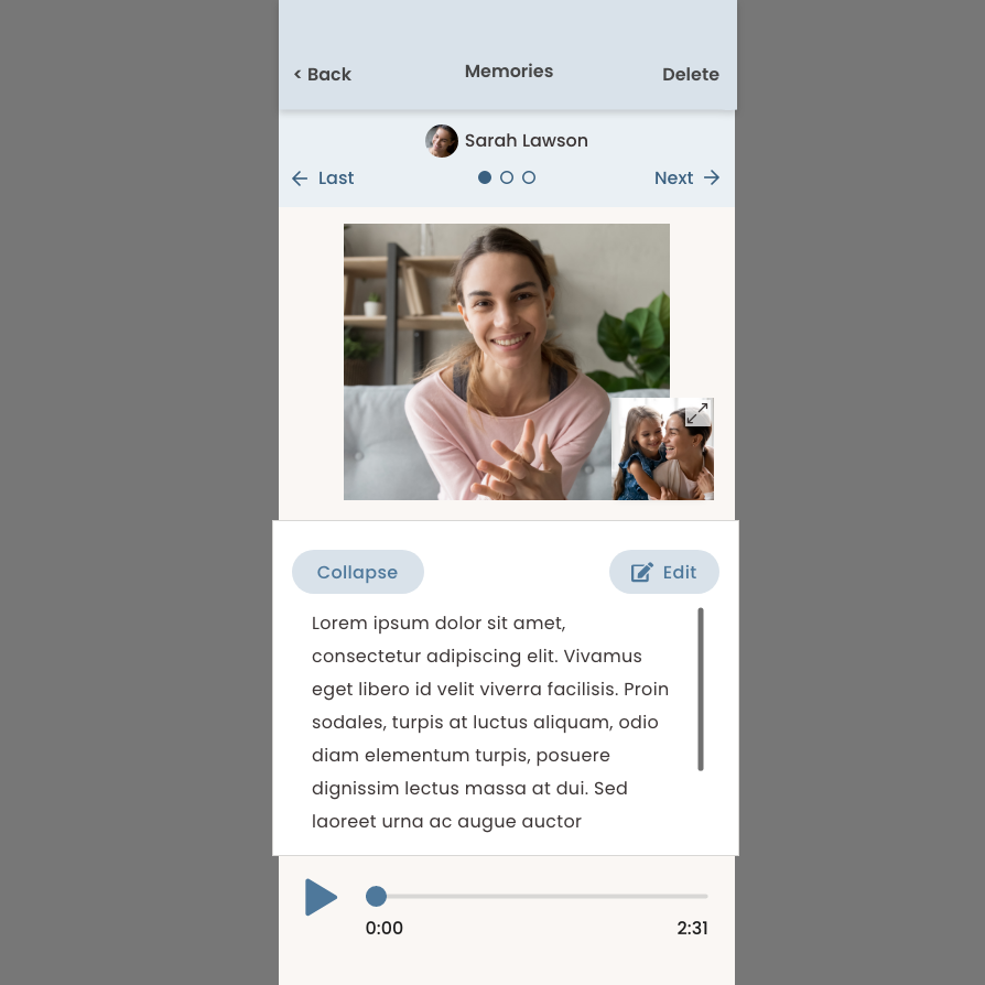
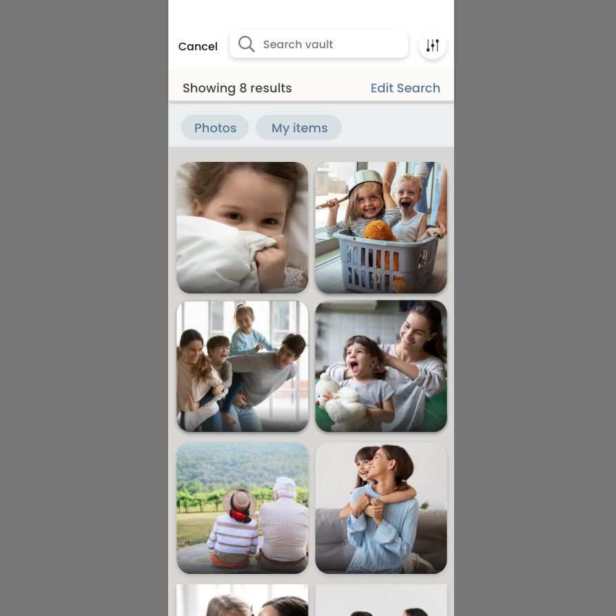
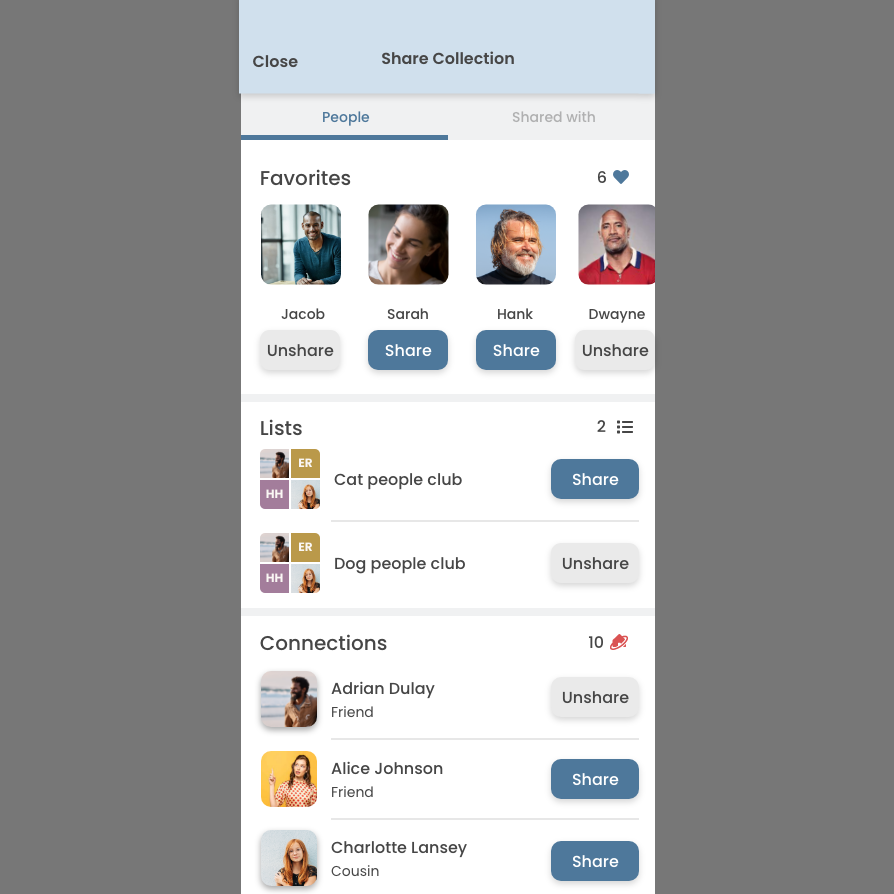
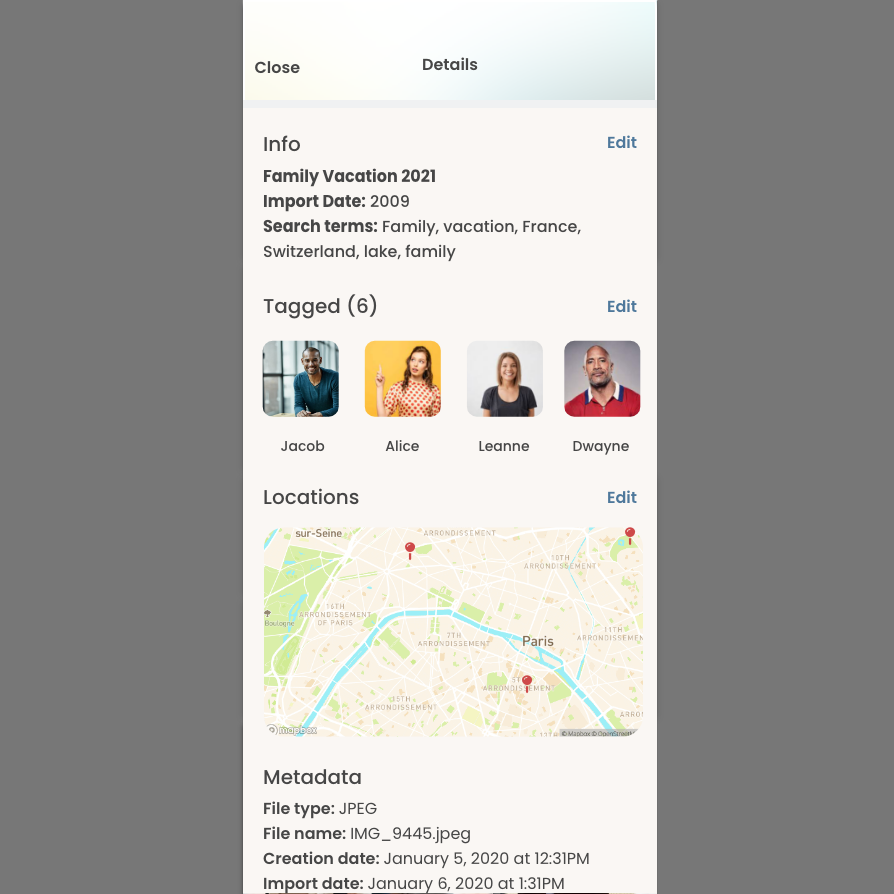
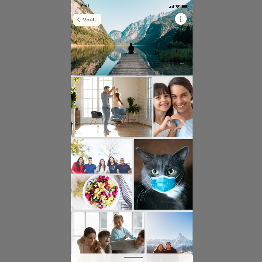
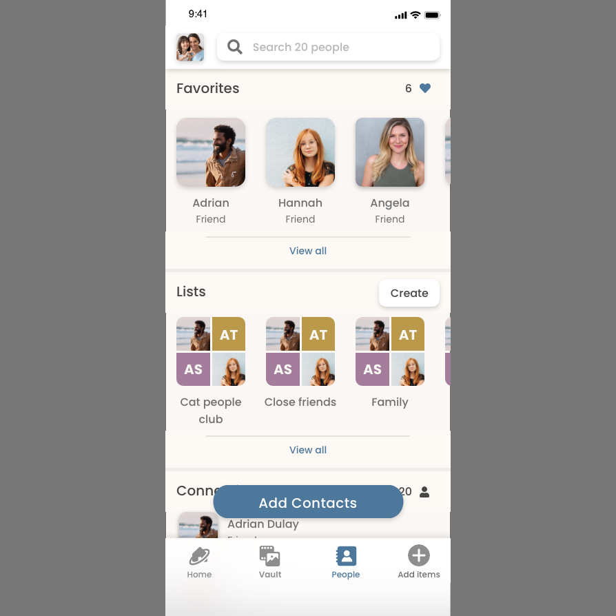
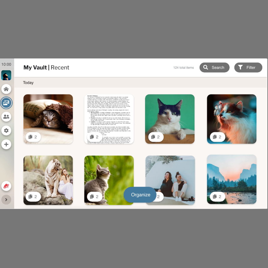
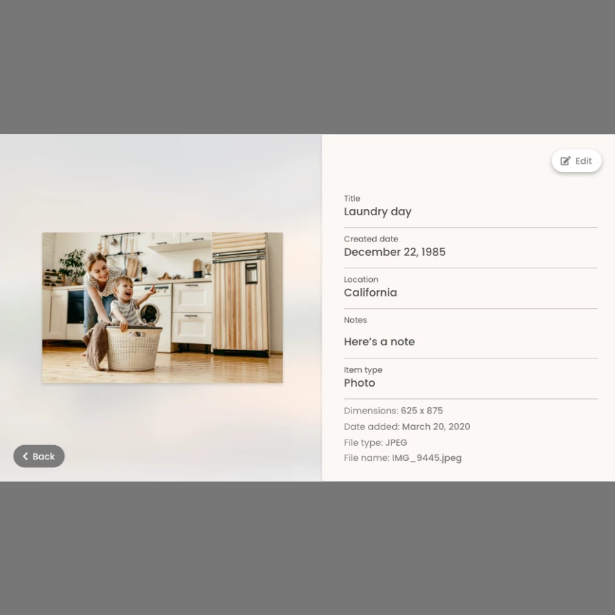
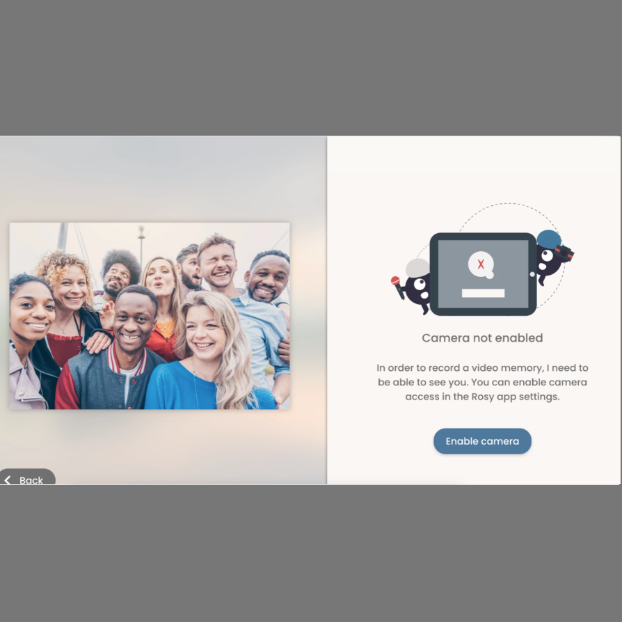
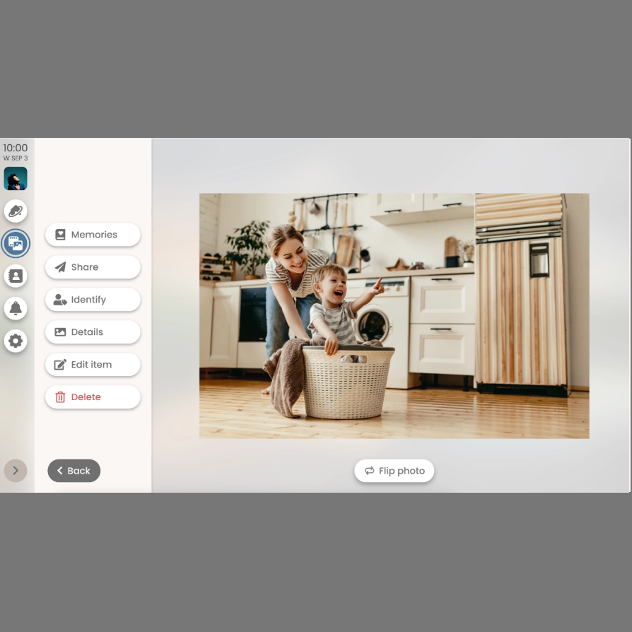
Rosy is a product by Wrethink, a startup run by some of the biggest and most influential names in telecommunications. Utilizing an inhouse coded AI and leveraging existing APIs, the Rosy system is able to store, recognize, and retrieve a user’s most precious photos and videos. My work with Rosy has been creating the foundation for the user experience and creating seamless user facing integrations of voice recognition, automatic transcriptions and face recognition
My work with Rosy has been an ongoing experience. While a physical console system is still in the works, I have been primarily working with the mobile applications and transitioning towards cross platform functionality. In 2020, I was promoted to Lead Designer to help with project management, planning, and order clarification, delegating tasks and planning for deadlines across teams.
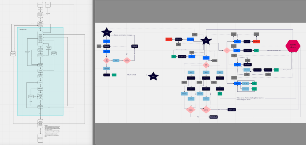
Project Briefs and Workflows
Lots of the processes began with sitting down with the Head of Project Management and engineers to discuss the scope of the projects. We would roundtable our thoughts, concerns, and questions, and try to address any timelines from stakeholders and engineers. From there, I would go hammer on workflows, looping in engineers along the way. Sometimes the workflows would be technical, yet straightforward, relying on a streamlined flow experience.
…sometimes a little more chaos was necessary but I tackled both scenarios just the same.
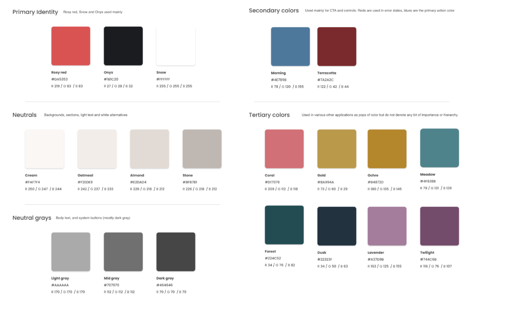
Wireframing and Design
After receiving the green light from all necessary parties, its time to start sketching and designing. During the sketch process, which sometimes would be pen on paper, sometimes on the computer, I would always keep in mind our various design systems. Which components could I reuse and repackage to create a coherent overall system? Which rules have we set for these various scenarios and how can I leverage them?
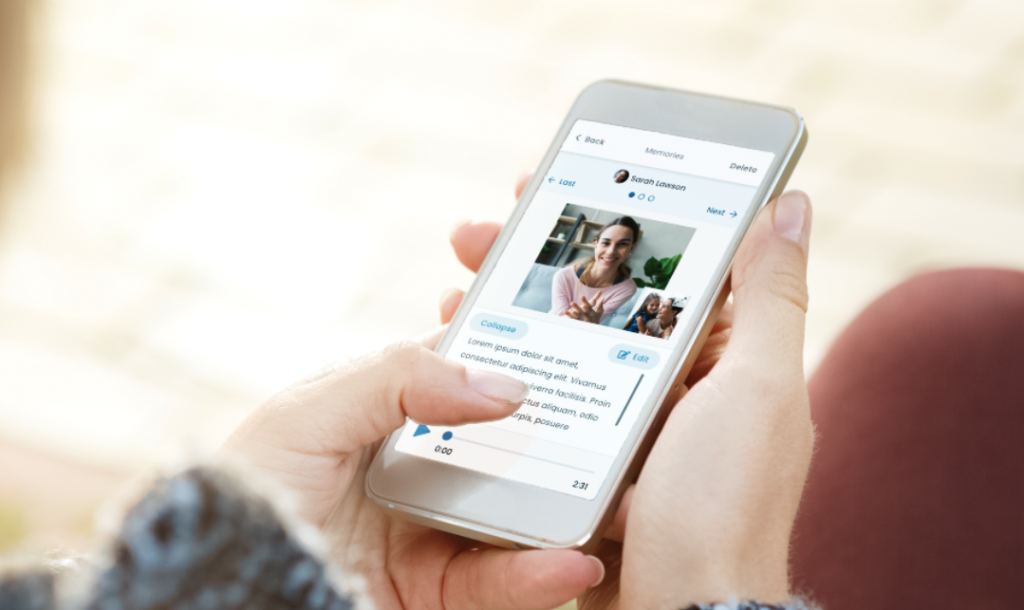
Testing and Iterating
After initial designs are built, we send it off to our third party testing agency, Userlytics. From there, they would take our designs and run through prescripted scenarios to better understand the publics perceptions and first impressions. After receiving our reports, we would take the findings to better enhance the designs.
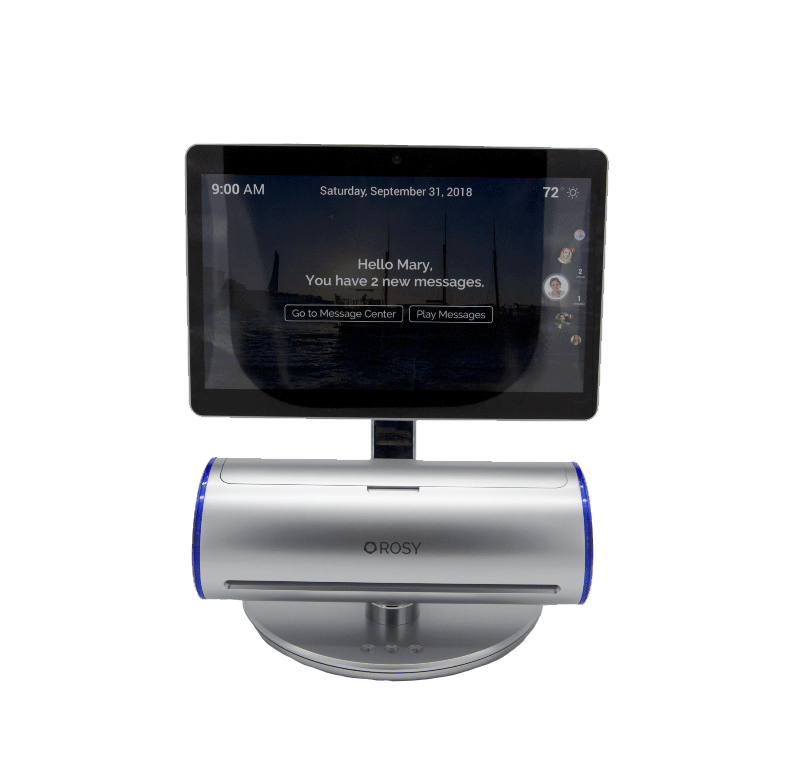
Rosy Device
In addition to the Rosy mobile app, we are in the works of developing a physical product that acts a Rosy specific hub for users to scan images, interact, and utilize using a combination of voice interactions, pipe light displays, touch interactions and a programmed “personality” similar to that of Siri or Alexa.
The device itself utilizes a scanner for quick and easy scans of paper items like photos and documents, and quickly organizes for recall. Using a combination of logic for item recognition, face recognition and OCR (optical character recognition) we were able to come up with a series of logic around recall and organization.
Currently, the Rosy Device is going through another round of iterations to account for some blindspots in ergonomics and accessibility that the product team pushed for over the years.
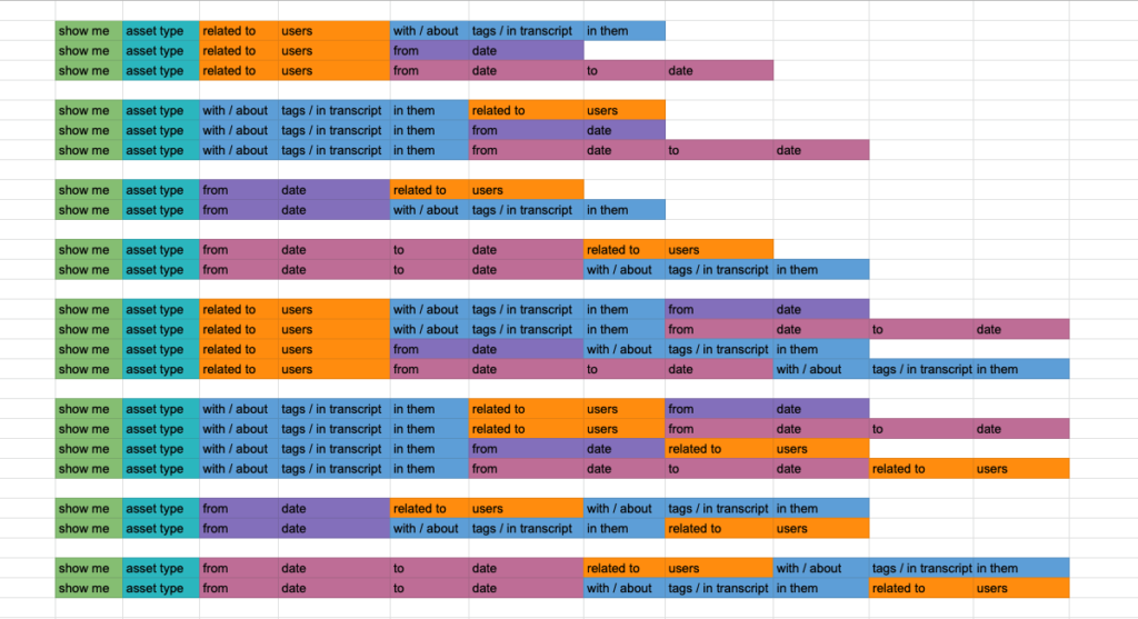
Console: VUI (Voice User Interface) and Logic
Utilizing both Houndify and Solr APIs as part of the console voice driven experience gave us a lot of interesting challenges regarding the interface interactions with the Houndify UI, as well as creating a database for experiences such as search. Using the search means we had to break down the queries in a way that a person would talk (as opposed to an experience like typing into google) Additionally, we had to create a data base for common synonyms that a user may use in place of our own biased vernacular and vocabulary.
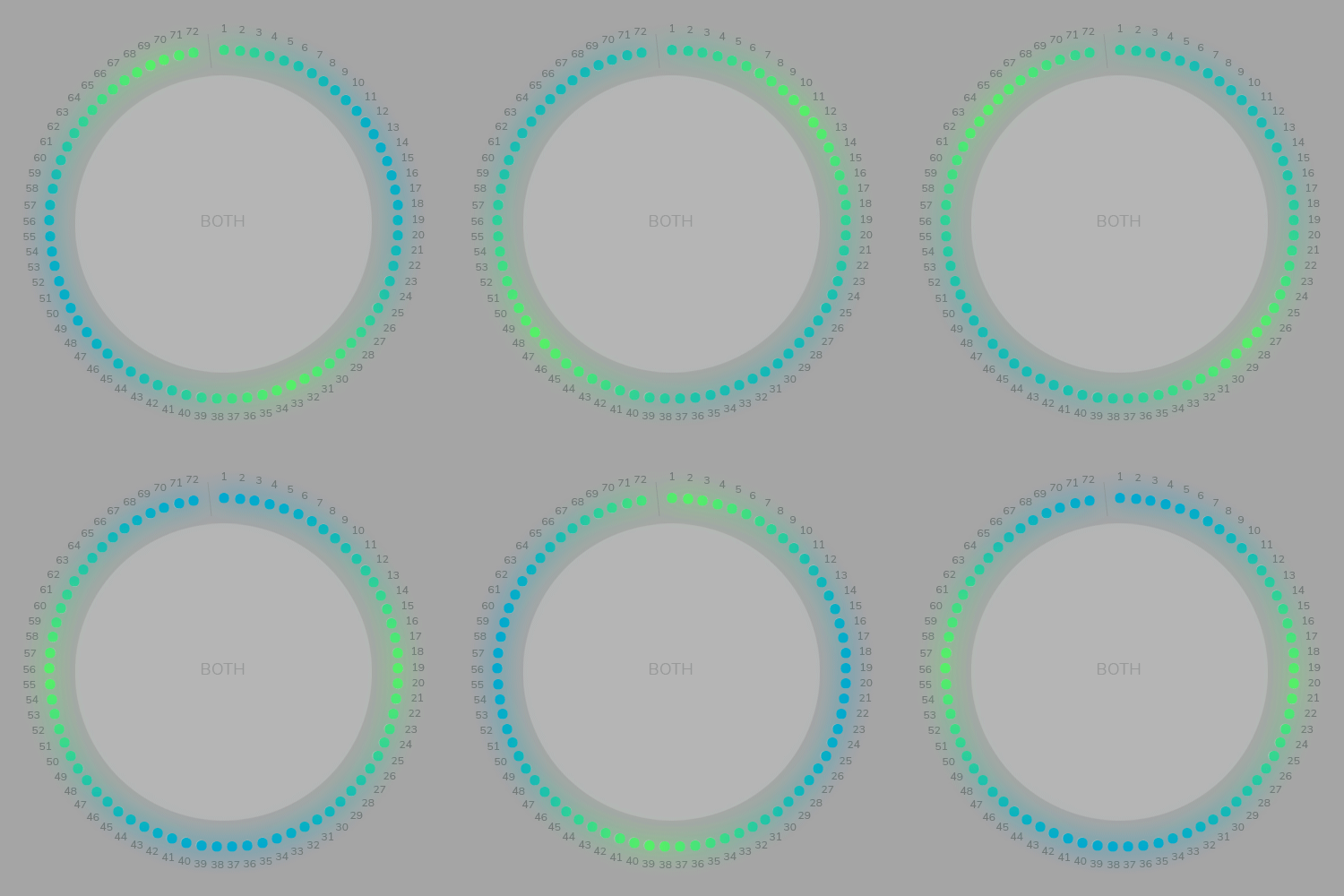
Console: Light and Character Interactions
In order to create a more “personalized assistant” experience, we put together a logic for the pipe lights on the console as well as a “character.” Using 72 RGB lights on each side of the scanner (144 in total), as well as 3 lit buttons, we were able to create “moods” for various scenarios, such as recording and error states.
Additionally, an earlier iteration of the device used the old logo as a “character” To avoid the uncanny valley, we avoided anything resembling a person. However, it was a fun challenge to try to create a personality without the use of human facial communications. Through research, I found personas that were considered trustworthy and used videos of them to inspire how Rosy moved and interacted with the user. I also set up a rig via Adobe Character Animator to create expressions with more fine movements. Though the ‘character’ idea was eventually scrapped and Rosy rebranded, it was still a very cool experience becoming the ‘face’ of a product.

Additional: Animations
I was tasked with planning, creation and implementation of a good chunk of the animations throughout Rosy. Utilizing Adobe After Effects, Bodymovin, and Lottie files, I worked to create seamless interactions that allowed for a more engaging experience. In previous logo iteration, we utilized the shape to create a Rosy avatar that had to feel real and personal. A lot of those animations were taken and created by watching the natural movements of real people as well as rigging it as a puppet and using my own movements.
Best Takeaways
A big approach to my designs was thinking about the accessibility and ease of use across the application and device. I strove to maintain consistency without stifling creativity. An amazing part of working on Rosy has been the incredible work from the engineers in developing intuitive logics for voice commands, visual displays and image retrieval.
Challenges
As a start up company with near unlimited funding, sometimes projects and deadlines would shift around. As someone who is data-driven, not quite getting to the point where we can confidently test with a large beta group and not our Userlytics crew was what I have been striving for. Another challenge was working with the physical console and striving for a more ergonomic and accessible design.
What I Learned
This whole product has been a test in patience. From various shifts in priorities, I was always on my toes. I took on a lot of project management like experience which has allowed me to better prepare for future projects and responsibilities.
Mobile
Console
Animation Examples
