My.Pathway Portal
My.Pathway
A portal for users of Pathway DNA products that allows the user to view results and find the best path for optimizing their health. Worked with additional designer to create the most streamlined and optimized experience for users. Designs had to translate to physical copies that were printable. Information had to be digestible at a glance, and carried over from test to test, some of which were vastly different in theme.
My time at Pathway Genomics allowed me to have my hands in many different honey pots. This portal was my first big project upon hiring, so I found myself hit with a lot of information to consume all at once, not just about the company but the genetic space in which they operate. However, this gave me an opportunity to see the company and the information they’re putting out through a new lens which helped inform how I approached breaking down UI and graphics for scanability and digestibility for consumers.
UI, Iconography, and the Importance of Simplicity
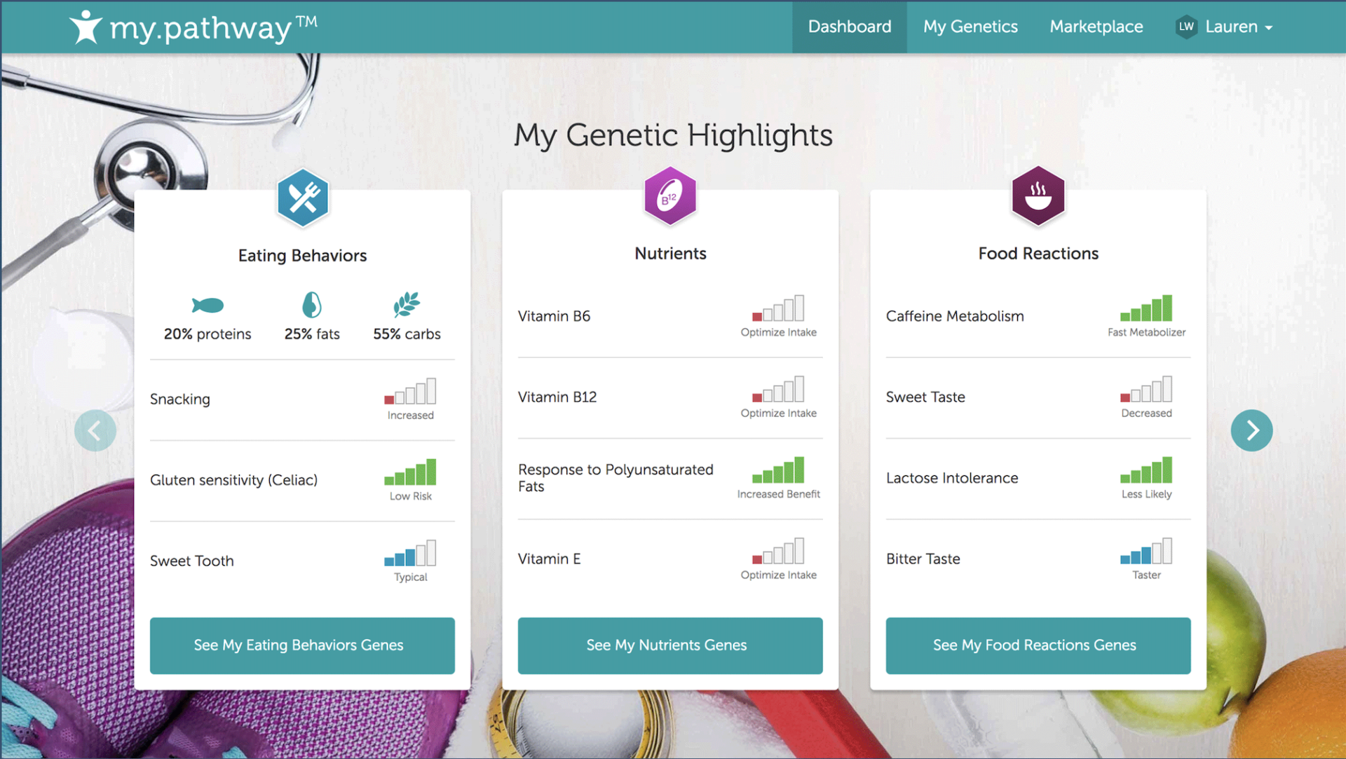
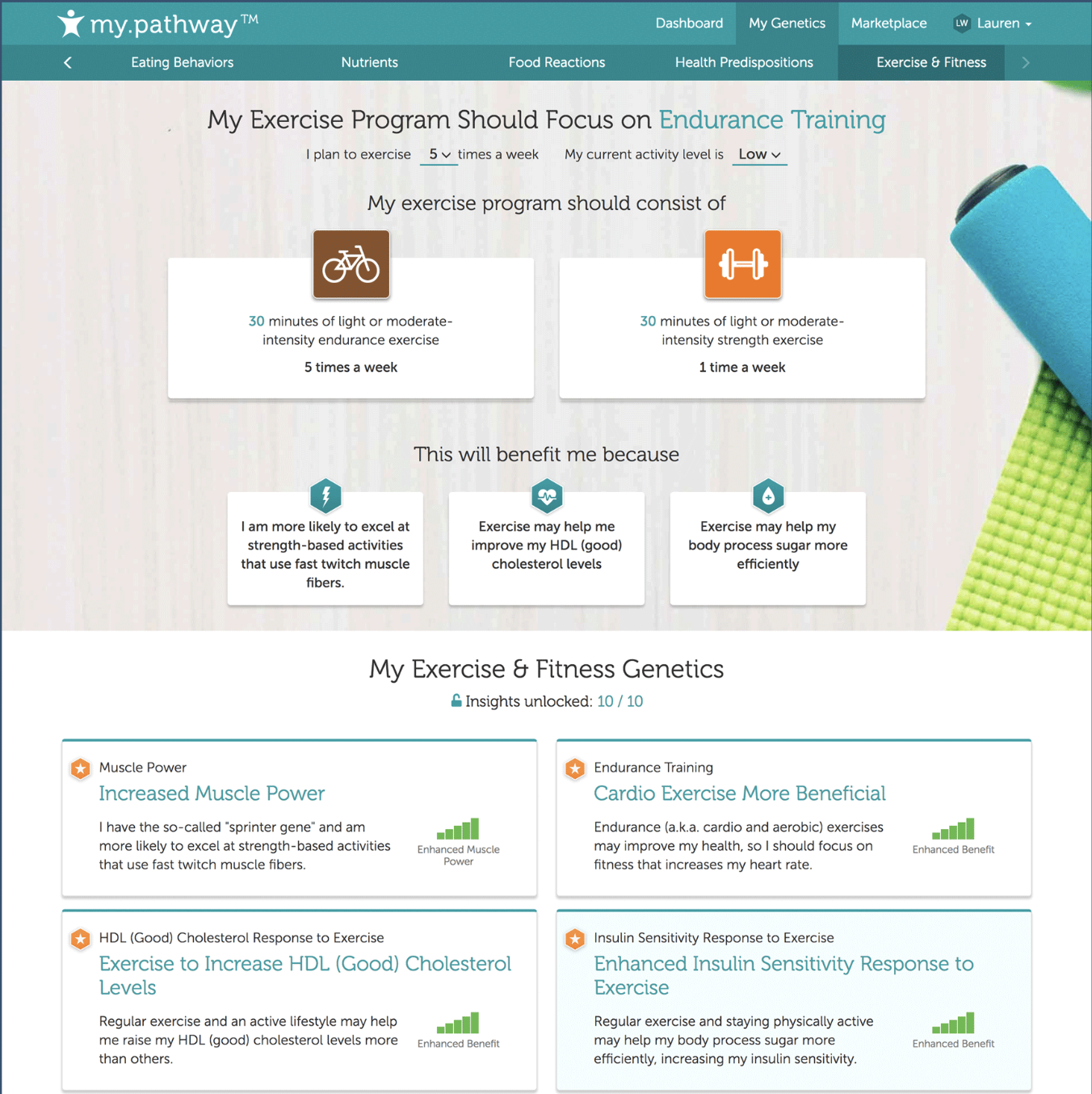
A challenge in creating a wide array of iconography for the portal was in creating something easily scannable, consistent and understandable. A lot of the science behind the product is not really easy to digest for most people so it was important to me to break down concepts to the most basic of representation. Near the end of the project, more than 50 unique icons were created.
For the data, I went through various iterations of how to represent the intensity of a data point. I finally settled on using the bars as indicators, and colors are a representation of positives and negatives. I went through the office to poll coworkers’ opinions on what the ideas meant and the bars were overwhelmingly the easiest for those polled to understand.
Additional: Support Material
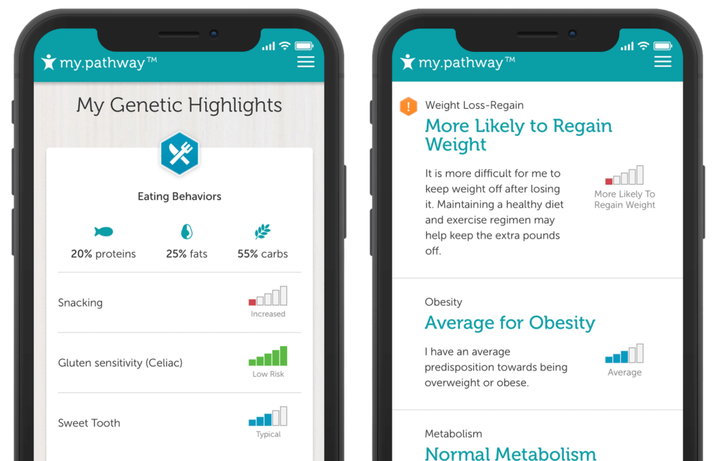
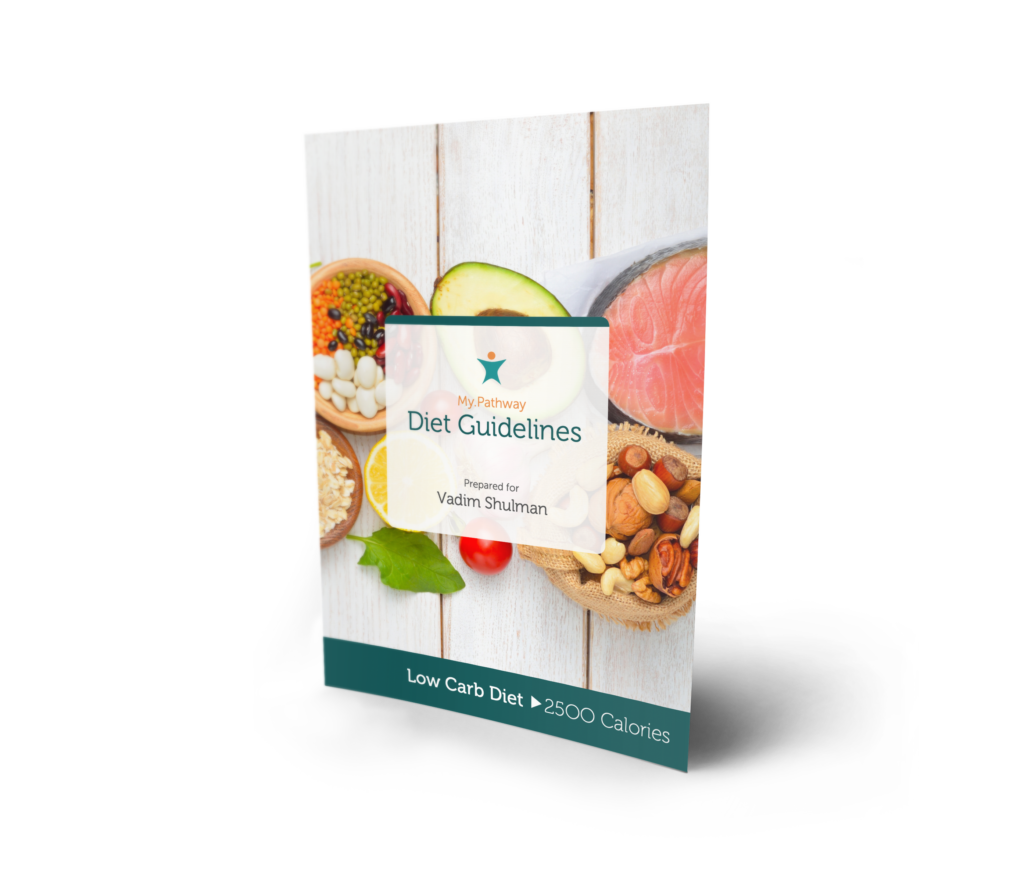
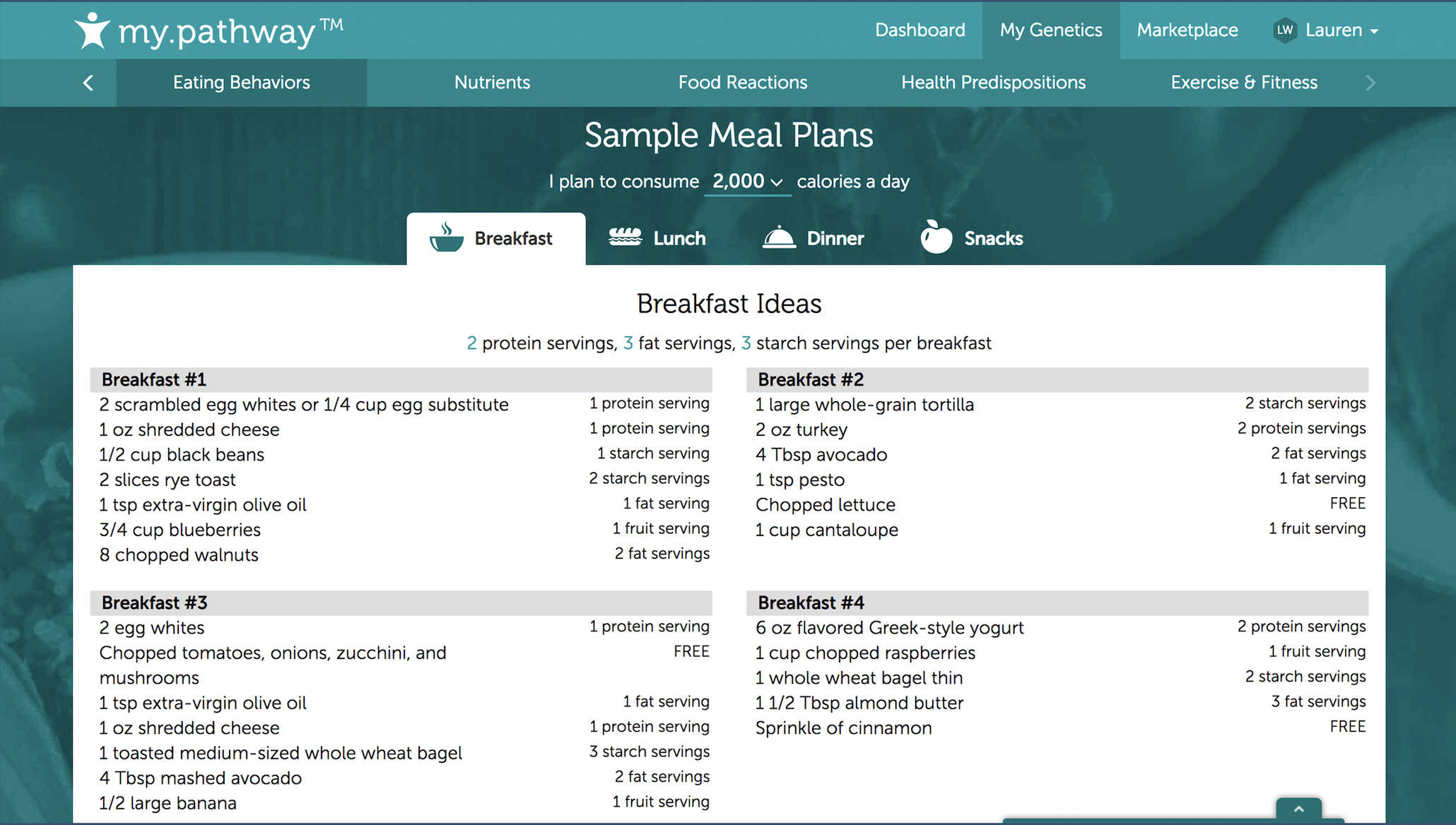
An additional and unique challenge was the amount of support material that was required for the user. From personalized reports, recipe guides, and a unique mobile app experience, much of design revolved around maintaining consistent themes and experiences. Even the materials involved spending exceptional amount of time creating logic with the engineers for the products to seem as authentically curated as possible.
Best Takeaways
The best takeaways I got from this was learning how to be slow and calculating. Finding the best solution took an incredible amount of time, patience, and went through many ugly variations. Additionally, the challenges with working with different functionalities and making them work together proved to be a fun challenge.
Challenges
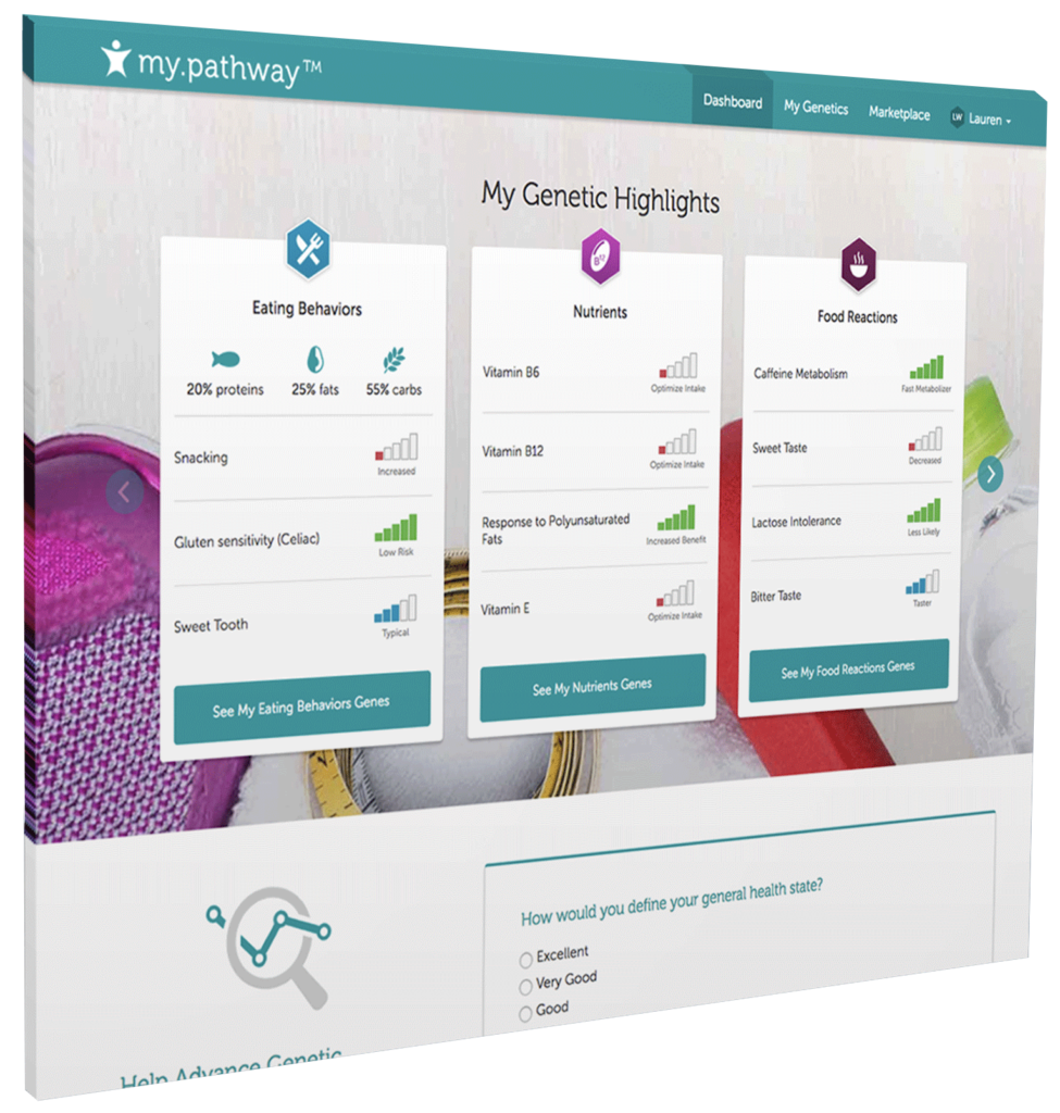
Much of the challenges stemmed from having to curate an experience that was not only responsive in nature and across print and digital mediums, but also ones that were easily digestible. There was a tightrope balance of making things visually interesting and scanable that I think, over many iterations, we were able to create.
What I Learned
I learned a lot on patience and pushing through the awkward UI phases. At first, things will probably not be perfect or where you want it to be, but given enough iteration and time and effort, there is a solution.
Screen Shot 2022-02-20 at 3.06.41 PM
Screen Shot 2022-02-20 at 3.07.00 PM
Screen Shot 2022-02-20 at 3.06.29 PM