Pathway OME app
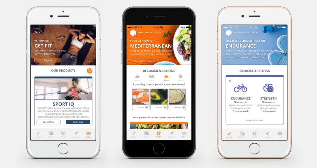
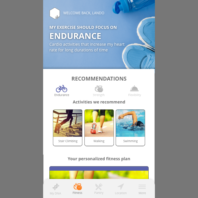
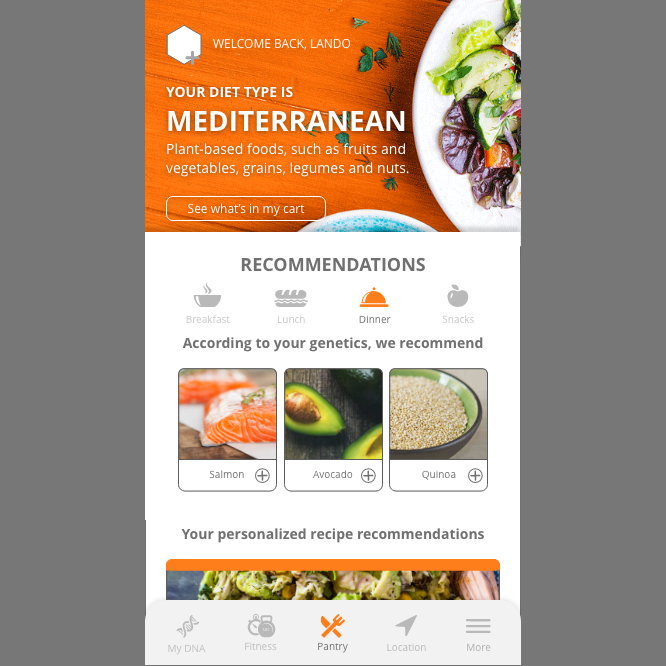
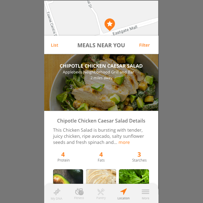
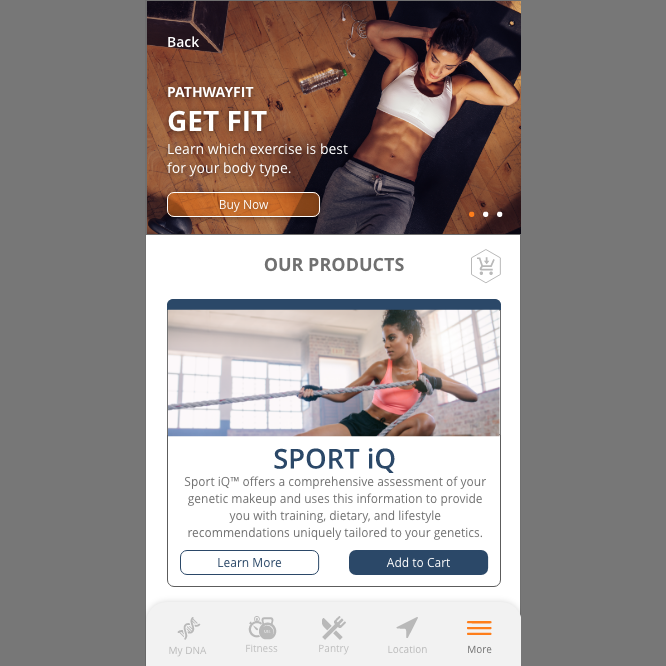
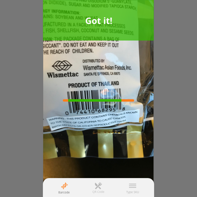
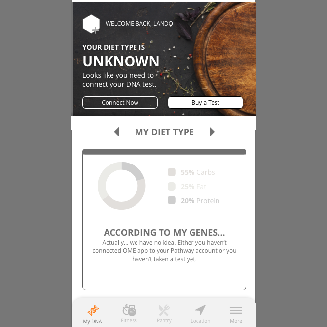
In addition to the website portal for customers to access their results, we also developed an app that would allow a more streamlined results experience. The user would be able to track their information asa well as find recommendations based on their results, whether it be for restaurants, fitness, or other products.
My job with Pathway was as the Graphic Designer, but I absorbed the UX/UI position as the designer was out for maternity leave. That time was very important for the company, as they were bringing in stakeholders to demo their ideas. I was thrown into the lions den but was ready for the challenge. On my own independent time I learned the systems necessary to successfully begin work on the Pathway Ome app and with the help of our engineering team, successfully brought it to life.
Approach and Challenges
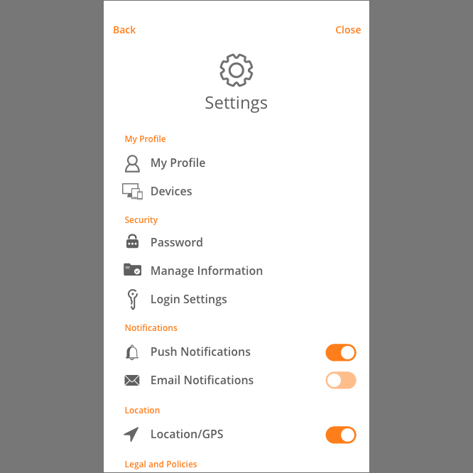
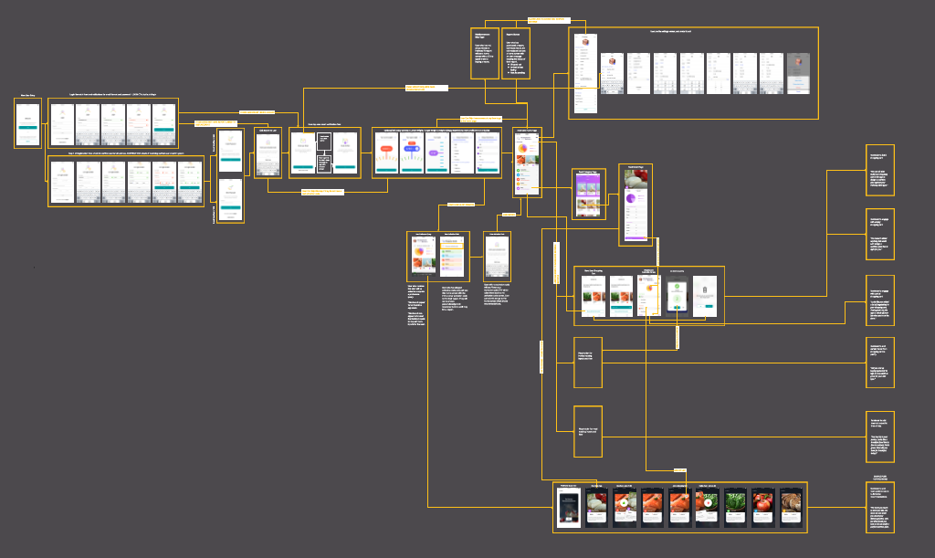
There were a few challenges we had to contend with. Firstly, the sheer amount of information. How does one layout scientific and sometimes tedious information in easily digestible ways? We tested different methods of displaying info using combinations of color theory and recognizable icon variations to pinpoint what a good number of people could understand. For navigation, we broke down every functionality into the highest levels we could and utilized existing patterns in UX for people to easily navigate around the app.
Product and Takeaways
The results were a very robust user journey that is both informational and informative, allowing the user to take their data and apply it towards living a healthier life. Some takeaways were the challenges that come with large amounts of data as well as how to make that information scannable and easy to understand for the masses. Identifying what would be important for a user and highlighting that and whats more support information was a fun challenge that Im glad that I got to be a part of.
